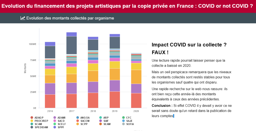
Created by the users and the systems, stocked in the discs and RAM modules, travelling through cables, routers, servers exploited by the computers, smartphones, clocks, televisions, paying terminals, industrial machines, robots etc. The data are everywhere, but stay paradoxically invisible.
The data: from gold … to the black box

Beyond their role in the functioning of the systems, the data have a basic, sometimes important value. They are often a major asset of the company. Yet we still need to explore this black box full of nuggets!
The visualisation of the data (also called dataviz or data visualisation) has a magic side: it allows us to see the things that stay indistinguishable without it. It acts like a revealer of the meaning and the value of the data.
The dataviz: a point of view on the data
To represent the data is only the final stage of the process, which is sometimes long and complex.
Initially, there is always a goal: why represent this data?
We represent the data for two main reasons:
- Communicate
- Encourage action
The needs to be covered are countless:
- Understand a situation (audit, analysis of the existing, research of the proofs)
- Optimise the business activities (performance, efficiency, following of the objectives)
- Foresee the scenarios or the events (predictive analysis, crisis management)
- Share the informations (reports, dashboards, alerts)
- Popularise the information (sciences, medias, events)
- Sell the products or the presentations (argumentary, comparison, results)
- Convince the public (communication, influence)
- Supervise the infrastructures (monitoring, security)
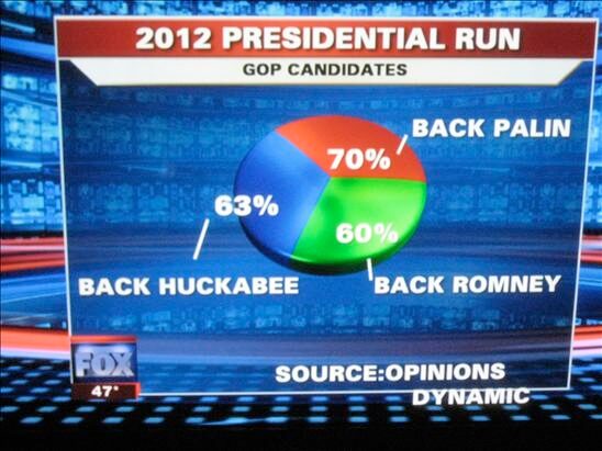
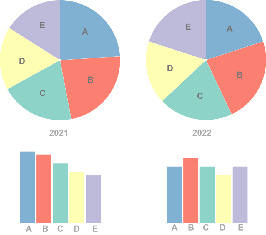
The definition of a goal necessarily induces a bias. With the same data, we can create tens of different representations, each one bringing a different perception and message (like shown perfectly by Hackaviz, the competition of the visualisation of the data organised each year by Toulouse Dataviz, based on a unique dataset).
Therefore, a representation of data is never completely objective, you just need to not cheat too much with your public!
Besides, speaking of the public, it’s time to ask the second question: who needs this data to be represented?
We have the goal, but depending on the target, the way to restore the data will be very different. The targets have certain characteristics, who have a direct impact on the work of data visualisation:
- Competencies (understanding of the context and the data)
- Maturity (analysing capacity, deciphering of the message, analytical mind)
- Cultural and social profile (usages, perception of forms and colours, interpretation of a representation)
- Authorisations (access rights, decision taking, delegacy)
- Accessibility (means of access to the representation, cognitive or visual deficiency)
The puzzle of production
The last and most difficult question is left: how to represent the data?
In more complex cases, the execution can demand such skills as:
- Mastery of data (reliability of the sources, coherency of the information, objectivity of the indicators, constancy of the measure etc.)
- Ethics and absence of bias (objective selection of data, non destructive treatment, assumed and transparent biases etc.)
- Methodical realisation (narration, preparation, choice of representation, execution, diffusion)
Everyone can cover these three points at their own level and therefore produce quality representation simply knowing their real skills and limits, both in the mastery of concepts (probabilities, statistical calculations, semiology, cognitive biases etc.) and the tools (collection and preparation of data, generating graphics, animations, publication etc.)
To help You to progress (and avoid coarse errors!)Toulouse Dataviz proposes their Guide of data visualisation, realised in collaboration with the Data Office of Pierre Fabre. The main types of representation are described there with their reason to exist, their good practices, their traps and main tools that allow you to create them. You can even try them out online and see the impact of one simple parametre change!
Honesty, method and creativity!
Finally, we behold the key points of a successful dataviz:
- Make sure of the pertinence and the quality of the data
- Define your goal, the message to send
- Know your target and your capacities to understand the result
- Make a good choice of a representation depending on the objective, the target and your own skills
- Remain honest and explain the choices of your selection, preparation and representation of data
Like in everything, the know-how comes from doing it, we can only improve ourselves! The dataviz is a creative and motivating activity which has a real usefulness when it is well done.
It becomes unavoidable in the companies that chose the steering by the data (data-driven). It’s the operational quality of dataviz that will make a difference in the results, in terms of knowing how to define and implement the good indicators (exercise far from obvious!).
At Clever Age, we practise dataviz internally to measure our activities and make good decisions. We give advice to our clients about the analysis and the representation of commercial data (reporting, Bl, dashboards etc.) and the monitoring services (exploitation, flux, logistic, security etc.). And it’s a pleasure to help the Toulouse Dataviz association for years, since they have a real talent in promotion and diffusion of the dataviz to all publics!